Forex Winners | Free Download Downlod free trading sysrems , indicators and forex E-books
Trending markets are by far the easiest to trade and thus the most profitable. Also, I really think all beginners need to learn how to trade with the dominant daily trend before they attempt to trade range-bound markets or counter-trend. So, knowing how to correctly identify a trending market is very important to being a skilled price action trader. I hope this article improves your ability to spot trends and trade them.
Tools for identifying trends :
• EMA’s –
The general rule of thumb is that when they are crossed higher there is bullish momentum and possibly an uptrend, and when they are crossed lower there is bearish momentum and possibly a down trend. I say “possibly” because as the EMA’s lose effectiveness in trading ranges.
So, we have to combine the 8 and 21 daily EMA’s with other tools to properly identify a trending market…

• Analysis of daily chart price movement –
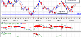
Learning to identify patterns of higher highs / higher lows and lower highs / lower lows is an important discretionary tool for identifying trending markets. We can see in the chart below an example of the daily EURUSD recent uptrend; we had the 8 and 21 cross higher and then a series of higher highs and higher lows. You have to learn to spot the moves and then the counter-moves, the daily chart is best for this; traders often get tripped up trying to identify trends on lower time frames. Our primary time frame for trend identification is the daily chart. Look at the example below of how to identify higher highs / higher lows. It is just the opposite for a downtrend with lower highs and lower lows. Also, look how these “confirm” what the EMA’s are showing you. A trending market will have both of these trend “tools” in agreement:

• Zooming out to see the big picture
Sometimes we get caught up analyzing only a week or two worth of price data. But, to identify the longer-term trend, we really need to zoom out and look at the last 6 months to 1 year of price action on the daily chart.
Zooming out and actually looking at the overall picture to see what the obvious slope of the market is, is a really good way to just get a quick and clear idea of the underlying market trend.
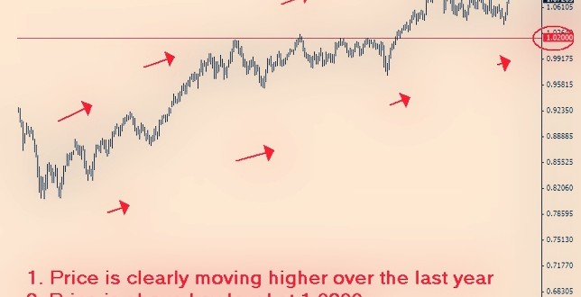
Let’s look at the daily chart of the AUDUSD for an example of how to zoom out and use what you see to determine the underlying longer-term trend. Note the market is obviously moving higher from the left side of the chart to the right side. This chart screen shot is showing about 1 year of price data. We can see there is an obvious major level here at 1.0200 and that price is still above this major level. So, the trend is still clearly up, even though recently this market has seen some short term downward movement. The point here is that it’s good to zoom out and look at the last 6 months to 1 year of price action to get a general sense of the longer-term daily chart trend. Having this bias will give you a point of reference for the 4hr or 1hr chart, and obviously for any daily chart setups as well. Although, I recommend all beginners stick to the daily charts and really “master” them before moving down in time frame.

Edited by Nikolai Jenkson